
ByteSpace
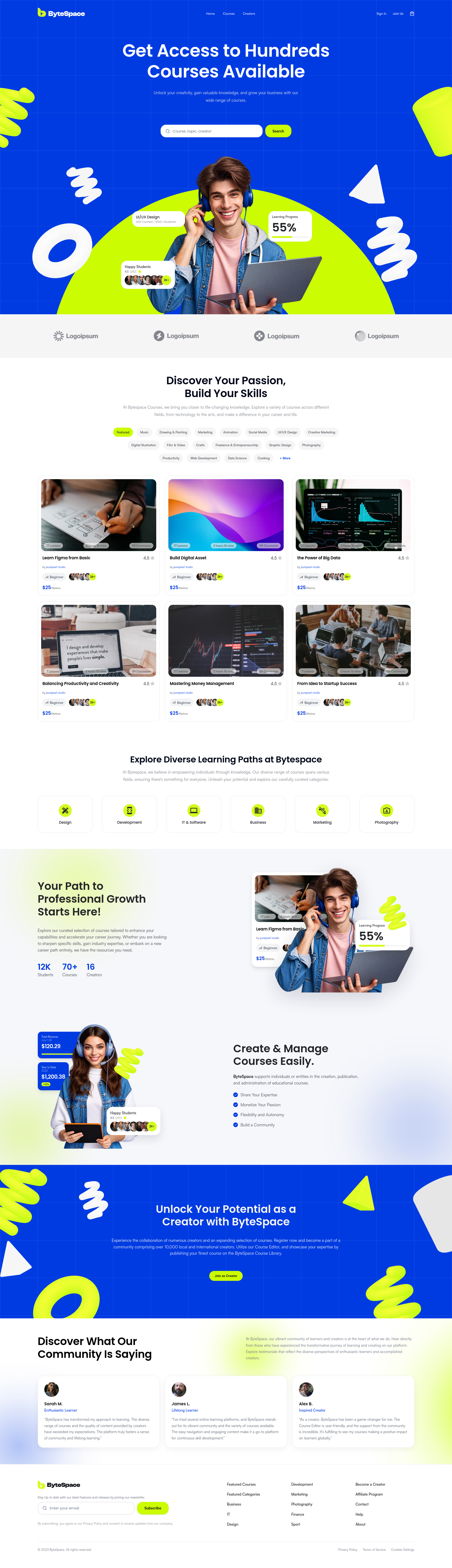
A modern, high-performance learning platform and creator ecosystem built following pixel-perfect design specifications — featuring course catalogs, dynamic syllabus previews, category filtering, and creator portfolios.
- >Next.js 16 App Router with React 19 Server/Client component hierarchy
- >Figma-to-code design system built with Tailwind CSS v4 and modern CSS variables
- >Multi-criteria course filtering & dynamic tabbed syllabus (About, Lessons, Reviews)
Project Vision & Meaning
ByteSpace was engineered to deliver a fluid, high-engagement digital academy and creator economy experience. In conventional e-learning interfaces, course discovery is bogged down by heavy page transitions, clunky filter refreshes, and disjointed course syllabi. ByteSpace reimagines course exploration with instant client-side filtering, interactive curriculum navigation, dedicated creator portfolios, and responsive layouts tailored from mobile screens to wide desktop viewports.
Real-World Problems Solved
Engineered a pixel-perfect, scalable frontend architecture based on meticulous design specifications. Implemented instantaneous facet-based search and level filtering, responsive syllabus accordions, video preview modals, and sticky checkout cards. Integrated a global responsive state store with Zustand to synchronize cart and preview states without layout shifts or re-render churn.
Challenges & Solutions
Responsive Multi-Tab Syllabus Navigation and Sticky Enrollment Rails
Problem Context:Complex course detail pages require synchronizing tabbed syllabus content (About, Lessons, Reviews, FAQ) alongside a sticky checkout and video preview sidebar. On smaller mobile displays, sticky elements can cause layout clipping and jarring scroll jumps when switching between long lesson lists and review sections.
Constructed a responsive layout architecture using CSS sticky positioning with boundary constraints and container queries. Created an accessible, keyboard-navigable tab interface with framer-motion micro-animations, ensuring mobile viewports adapt the enrollment rail into a floating bottom sheet while desktops preserve full sticky sidebar context.
Instant Multi-Criteria Course Filtering Without Server Roundtrips
Problem Context:Browsing hundreds of courses across diverse categories, skill levels, ratings, and pricing requires responsive filtering. Triggering full page reloads or frequent server round-trips creates perceptible latency and breaks user focus during course discovery.
Built a client-side filter engine with debounced search and memoized selector hooks. URL search parameters mirror active filter states for shareability and deep linking, while data transitions are wrapped in React 19 transitions to maintain 60fps input responsiveness during real-time typing and pill toggling.
Clean Component Architecture & Zero-Config Tailwind CSS v4 Theming
Problem Context:Scaling dozens of custom UI elements (pill badges, metric cards, video player modals, creator stat grids) easily leads to CSS bloat, redundant utility strings, and styling inconsistency between dark and light accents.
Architected a strictly modular atomic design system in Tailwind CSS v4 using CSS variable tokens. Built composite, reusable primitives (Button, Badge, Modal, Tabs, RatingStars) with strict TypeScript prop contracts and ARIA attributes, reducing bundle overhead and guaranteeing consistent brand aesthetics across all views.